
Applying color theory to design can help improve an experience at a visceral level we may not even acknowledge ourselves. While designing a website, I like to consider the mood people will likely experience from using a product, and I try to highlight it in a positive manner. One effective manner to do this is by using color. Color is interpreted differently globally, so designing with that in mind is important.
Some of my favorite color schemes are found in nature, and they continue to inspire my design decision because we are natural drawn to them.
Does the product aim to make you relax?
Humans find nature relaxing, so using photos, objects, or colors inspired from nature can transfer over quite well in technology. As long as it matches the product’s experience and goals.

Harmony Herbal is using all natural products. They believe in collecting only fresh ingredients for a premium product. I created a logo with a yellow flower to highlight natural products being used, as well as the website’s background that uses yellow flowers. The Backgrounds photo also contains green leaves, just like the logo, and the main container.
I wanted the website to contain the general aesthetic of opening a product’s packaging, so I tried imitate product labels wrapped underneath the photo. I used color to add additional depth to the labels. Then I created emphasis around the text by using text of various sizes.
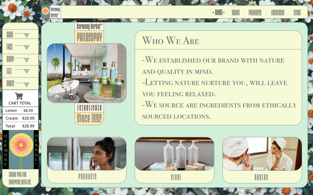
Accessibility standards are also important factor to maintain general use for the public possible. Using too much yellow can be distraction, so I muted the background image by decreasing saturation around the top navigation. This also draws attention to the navigational area, which is important. The area extends to the bottom of the Website, drawing attention to the bottom components.
